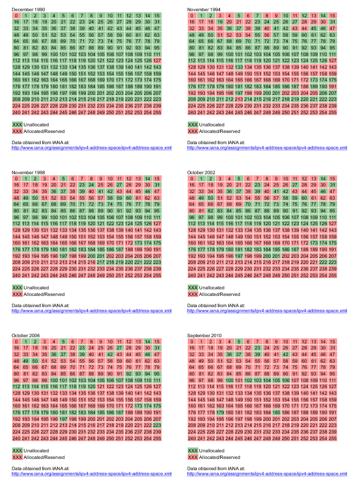
An animated image showing IPv4 exhaustion.
I have just built the following animated image, that shows how close we are getting from IPv4 address exhaustion. It shows which /8 networks have been allocated by IANA (turning from green to red) from the start of the internet up to now.

